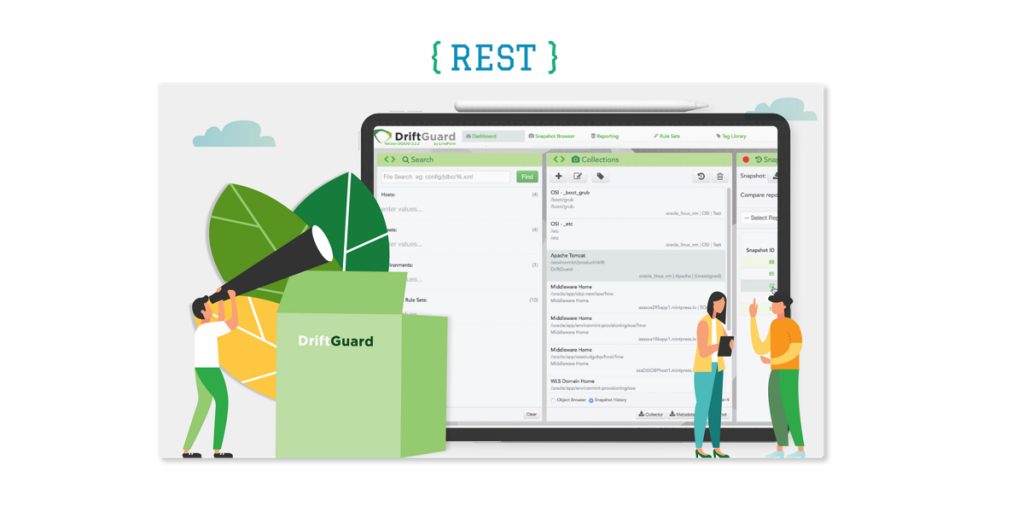
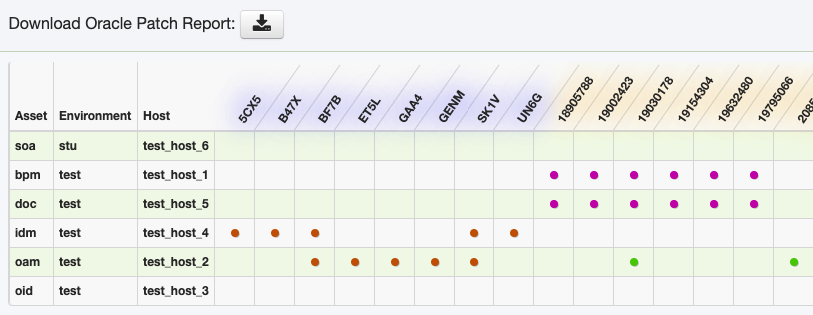
Custom Reports
The power of custom reporting in DriftGuard means that you can essentially build a report based on any of the data collected in the DriftGuard repository. Your only limitations are set by the data you have, and your imagination when it comes to HTML, CSS, and JavaScript.
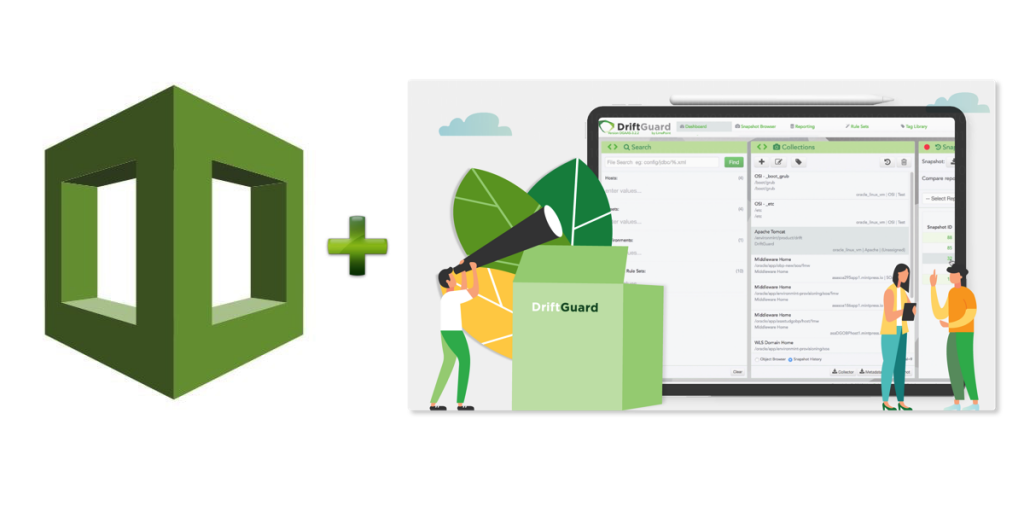
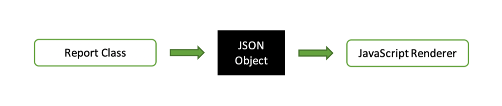
Custom reports in DriftGuard are made up of a Java class which is responsible for producing a JSON object, and a JavaScript renderer which is responsible for consuming that JSON object and producing the report in the browser. Where relevant, the Java class can also be configured to produce an Excel spreadsheet which can be downloaded via the browser to the user’s local machine.
Users can create and/or edit Java classes and JavaScript renderers directly in the application or develop them locally in an IDE and deploy them to DriftGuard following testing. Third-party libraries can easily be included in the list of reporting JAR files for extensibility. There are dozens of Report Types included with DriftGuard Enterprise such as patch reports, product version reports, inventory reports, collection reports, comparison reports, and as alluded to in this article’s title – heat map reports.
AWS EC2 Heat Maps
A heat map is a data visualisation tool and in the case of DriftGuard’s AWS Heat Map report, is intended to show areas of high EC2 activity in warm colours whilst cooler colours indicate that not much is happening. The colours mean that activity intensity is conveyed at a glance, at which point the user can drill down further to discover exactly what that activity is. In the screenshot below, the instances with more activity are shown in red and orange, whilst those with little or no activity are shown in green.
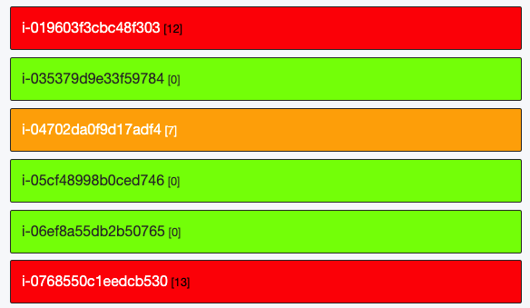
The underlying data for this report is retrieved by leveraging the AWS describe-instances command for EC2, and as such a range of metadata on each instance is available for the report.
 "AmiLaunchIndex": 0,
 "ImageId": "ami-036affea69a1101c9",
 "InstanceId": "i-08c66d2591c218cef",
 "InstanceType": "t3.xlarge",
 "LaunchTime": "2019-05-12T23:35:54.000Z",
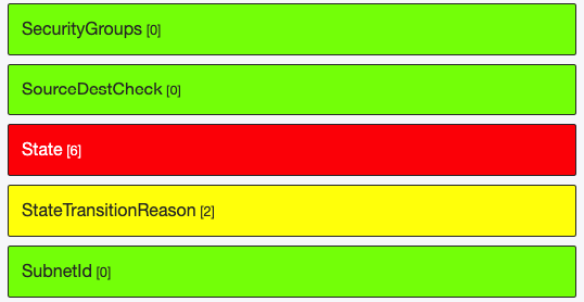
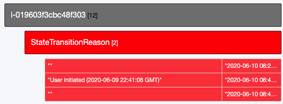
The report simply takes this metadata, looks for changes over time, and applies colouring to a greater or lesser degree over those areas where the changes occur. Drilling down on instance one instance for example, shows activity in a number of areas including State and StateTransitionReason.
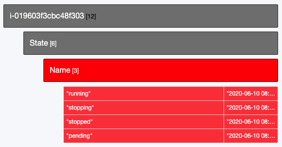
Drilling down on State, then again on Name shows the state changes for this instance that were captured when the data collections took place. As you drill down, the colour scheme is refreshed to apply to the visible components – this means activity within each section effectively has its own heat map.
Clicking on a parent row will take you back up a level, at which point, you can drill down into another section of the report to get a view of what’s happening there.
Heat Map reports are also available for Azure, and display similar instance activity albeit related to metadata retrieved from Azure rather than AWS.
It should be noted that these reports will not capture every change in your instances – they will simply capture instance metadata at the time the collection took place. So, if you have a collection scheduled every hour, this will effectively be a representation of the state of your instances on an hourly basis. This, of course, also means you also have a record of what instances were running at what time – perfect for auditing.
Summary
The Heat Map reports are a wonderful way of keeping an eye on your AWS or Azure instances and quickly focusing in on activity and/or auditing what changes were made to a particular instance. Importantly, if you see something you like, but want to tweak it just a little bit, it’s a simple matter to modify the Java or JavaScript right there in the console to produce what you need. Of course, being able to report on absolutely any of the data stored in the DriftGuard repository means that if you can collect it, you can report on it. This takes DriftGuard beyond the realms of a configuration drift and comparison tool, and allows you to utilise the stored data to provide a bigger picture of what’s happening in your target environments.